Tilted Vision
A post-modernist book design schematic.
Category:
Typesetting, Print design, Layout design
My Role:
Designer
About the project
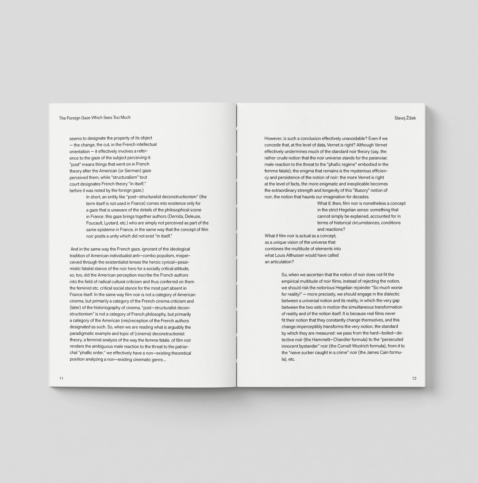
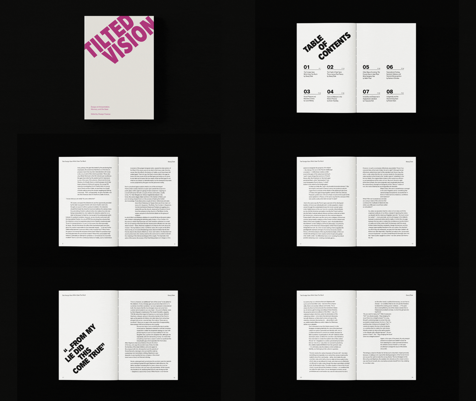
This project presents a post-modernist book design schematic for a non-fiction anthology, using a chapter by Slavoj Žižek as its conceptual foundation. Through typographic disruption and spatial tension, the design translates ideas of the foreign gaze, misrecognition, and unstable perception into a strictly typographic system.
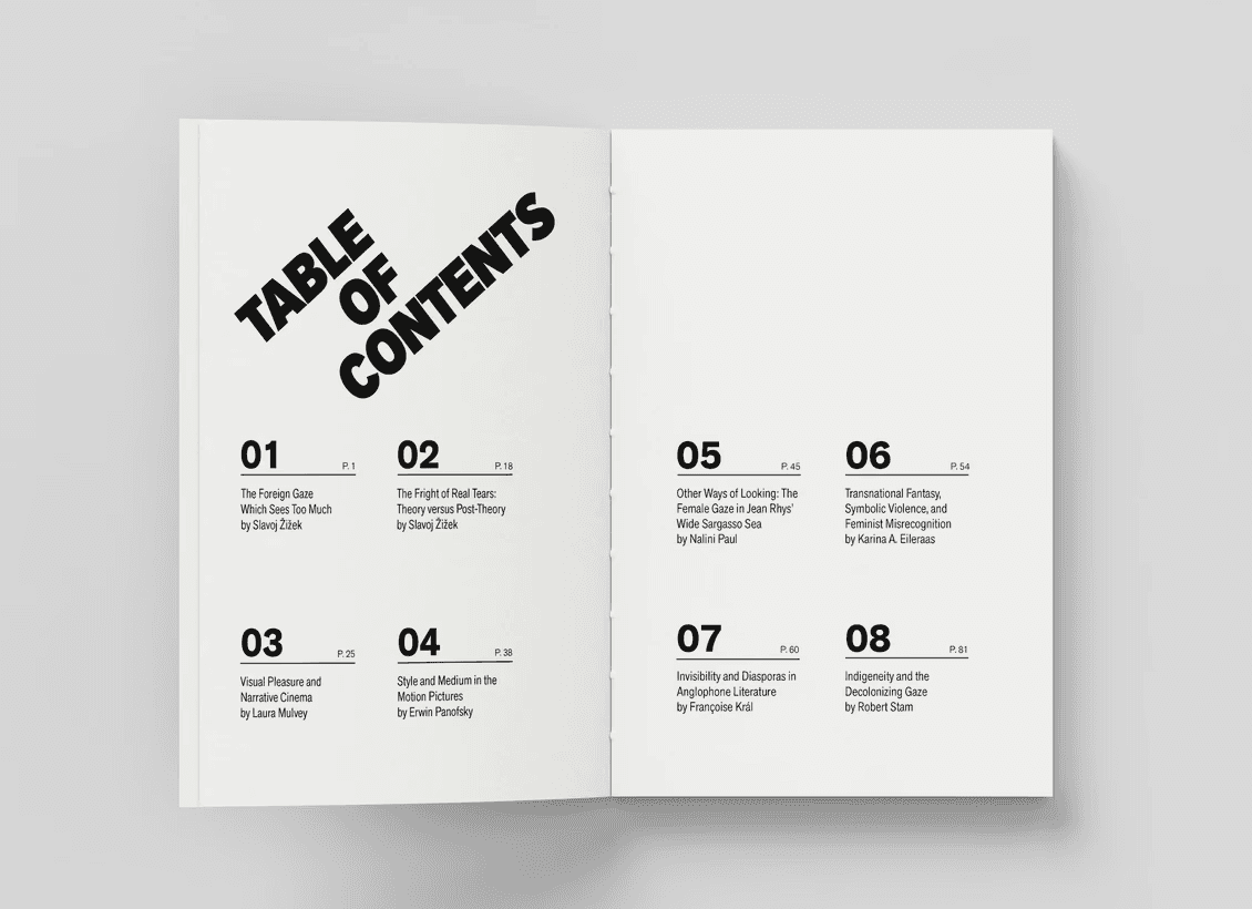
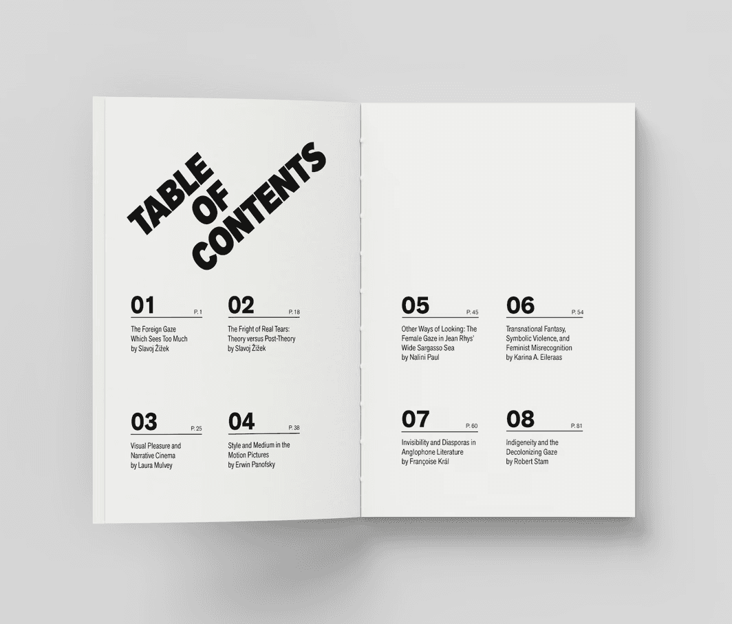
The design responds to Slovenian philosopher Slavoj Žižek’s claim that meaning often emerges through disruption, misrecognition, and the shock of first impressions. Through typographic disruption and spatial tension, the design translates ideas of the foreign gaze, misrecognition, and unstable perception into a strictly typographic system.
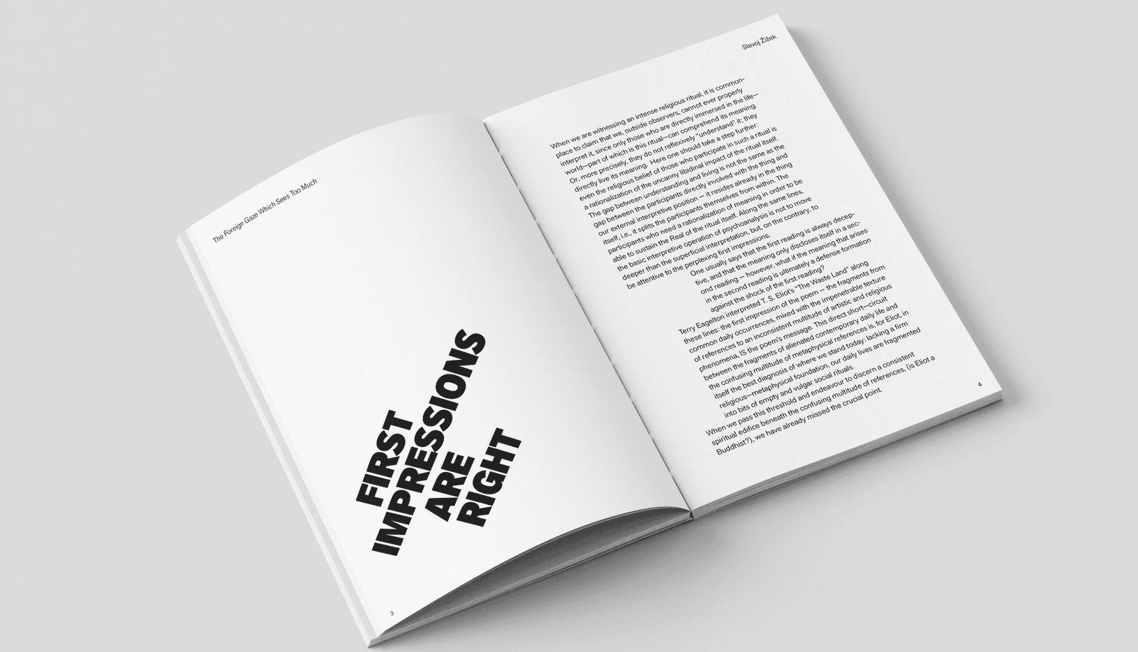
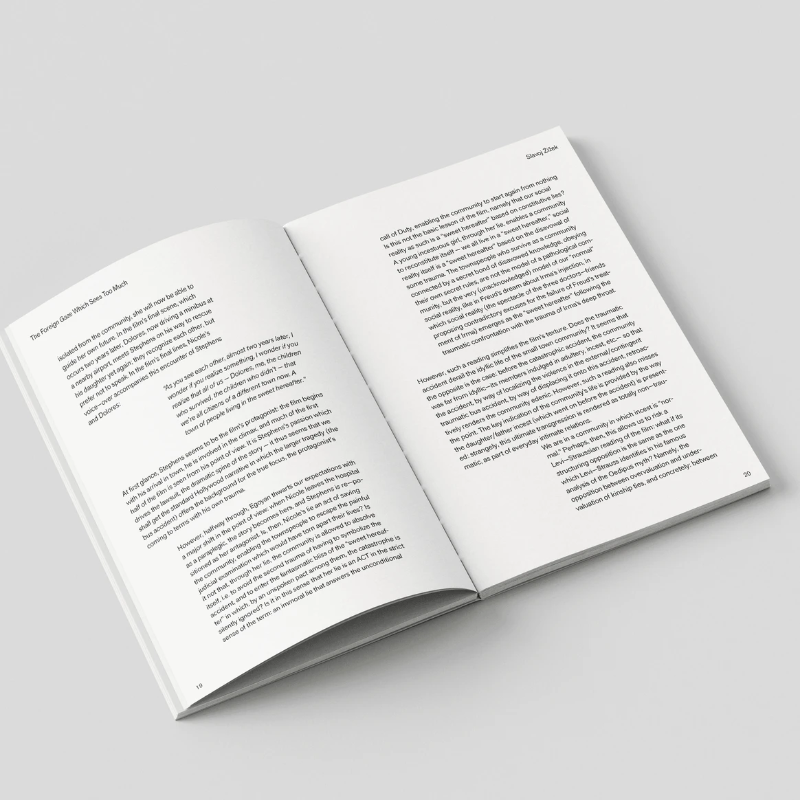
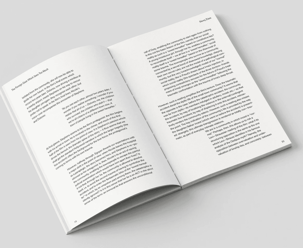
Offset passages introduce a cinematic sense of tilt, suggesting how small shifts in perspective can change meaning. Designed entirely in Adobe InDesign, the final schematic demonstrates how post-modernist typography can act as a direct extension of theoretical content.

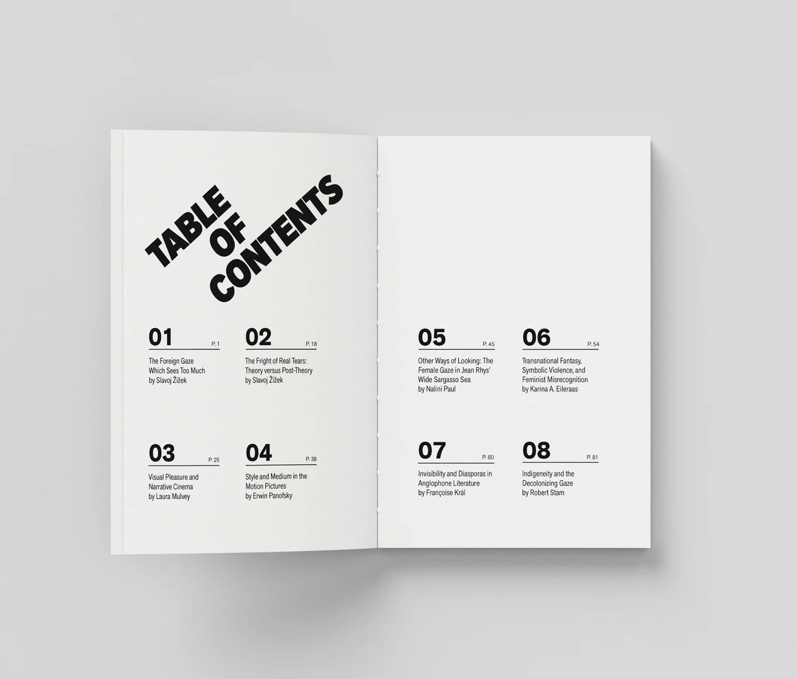
Working within strict constraints: a single-column layout, one typeface family, black-only interior pages, and no imagery, the project relies on typography, alignment, and spatial shifts to define the design language. The angled titles subtly unsettle the page while remaining legible, reflecting the tension between clarity and disturbance in Žižek’s writing.